

TAPAS MAGAZINE / SPAINMEDIA
stars in spring
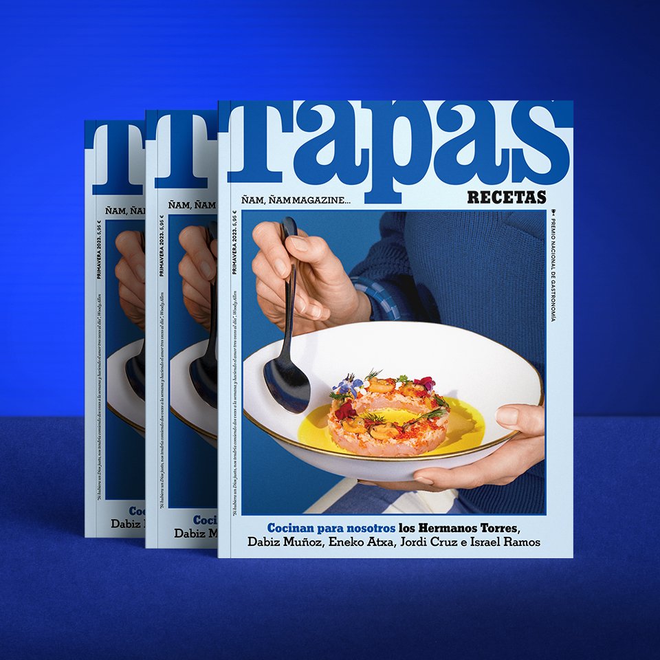
The April 2023 edition of Tapas Magazine Recetas is dressed in spring blue to host the most exclusive selection of restaurants in Barcelona, Madrid, Cadiz, Bilbao and Biskaia.
We have carried out the Food Styling, Set Design and Chromatic Development based on a wide range of blues, to share in this edition of haute cuisine, great recipes for snacks, starters, main courses and desserts from the best Michelin-starred restaurants in Barcelona.
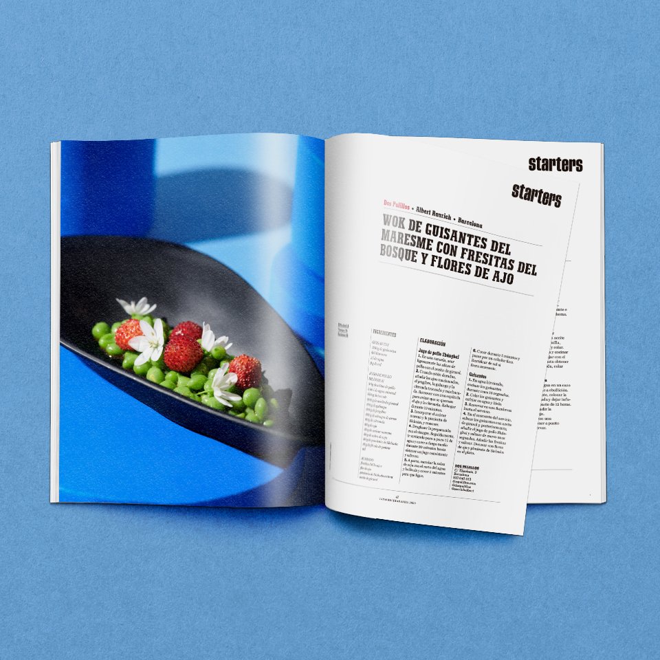
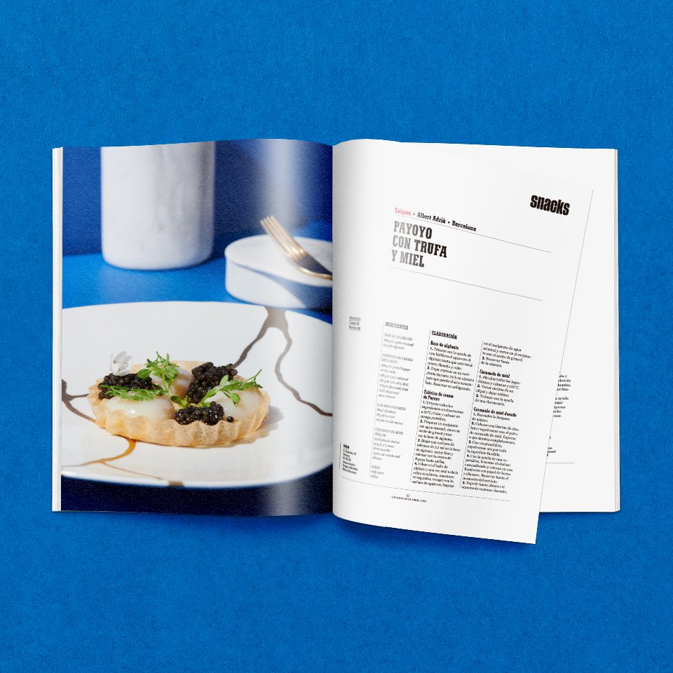
It is a privilege and a pleasure to have collaborated with the art of the best chefs who are part of Alkimia*, Àbac***, Aürt*, Cinc sentits**, Dos palillos*, Disfrutar**, Enigma*, Hisop*, Koy Shunka*, Lasarte***, Moments**, Montbar*, Slow & Low* and Via Veneto*.

Each edition of the magazine corresponds to a season of the year and its own color range. For this occasion, Tapas Magazine chose blue, a color that has multiple visual and emotional properties; with which, we developed the whole chromatic range to work on Styling, Set Design, Props and Lighting Design based on the background chromatic approach.


"In life, the sequences, which we usually call stages, interweave periods of stability with others of change, moments of growth and deceleration, all with a particular rhythm and color that we remember when we look back. No matter how much we try to control it, life surprises us.
And in our menu, in a way, the same thing happens, although we always try to ensure that a pleasant surprise is guaranteed.
Oriol Castro, Eduard Xatruch, Mateu CasañasOwners and Chefs of the restaurant Disfrutar**.
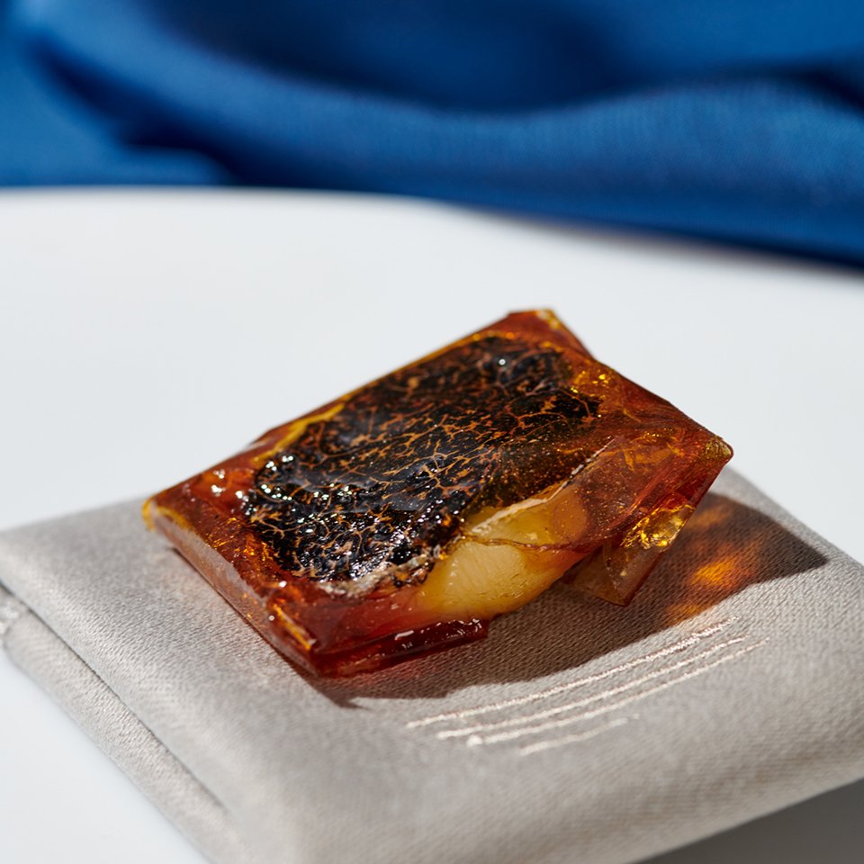

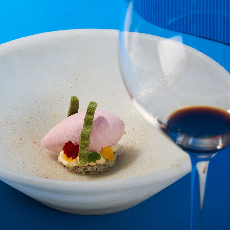
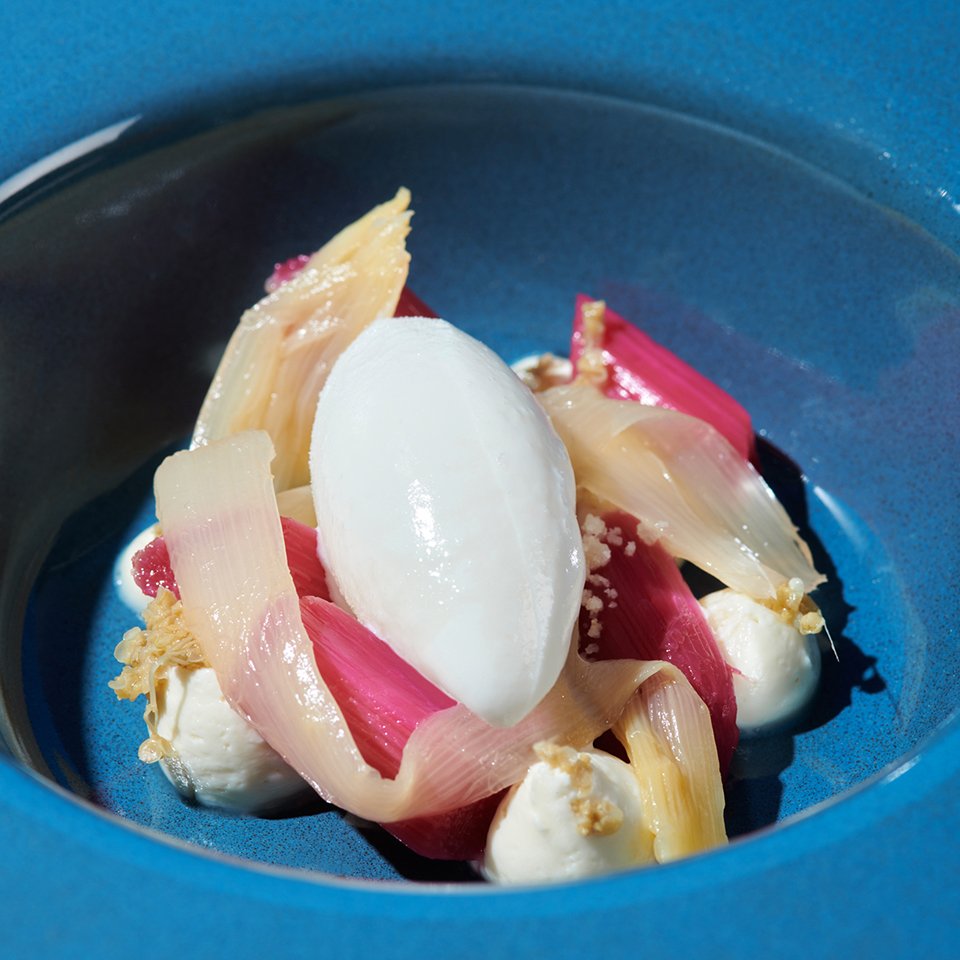
In gastronomy, the blue range is less common than other colors, which makes it a refined option to highlight some foods. The color blue in props, backgrounds, or details of the kitchenware that include ingredients of green or yellow tones, create an attractive and suggestive visual contrast.
The color blue evokes tranquility, serenity and relaxation. In spring-focused gastronomy, blue can be used to convey a sense of elegant freshness and renewal, as it is associated with clear skies and crystal-clear waters.
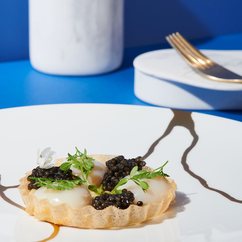
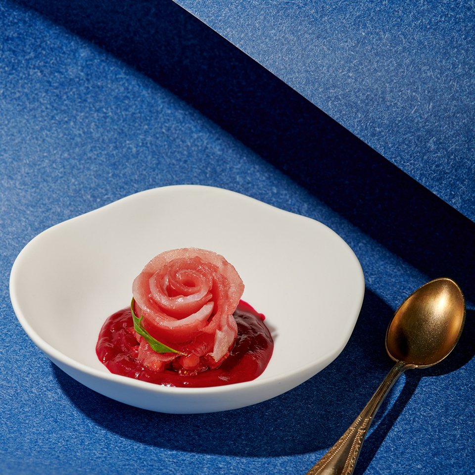


Indigo blue, dark blue, sky blue, turquoise blue, etc... are some of the tones that have been very effective in transmitting sensations of freshness, elegance and innovation, and to highlight some ingredients or dishes of haute cuisine taken to an editorial context in which color is the common thread of the April edition. The combination with other colors and textures has been key to achieve harmonious and attractive images.


Food Styling | Set Design | Chromatic Development | Photography Art Direction On-site
Styling & Set Design: Claudia Burbano de Lara | Photography: Marian Gumà for:
Lasarte***, Cinc Sentits**, Dos Pebrots, Aleia, Direkte Boquería, Libertine (Casa Bonay), Cruix, Besta, Bar Lombo, Alapar, Palo Verde, The Alchemix, Can Pizza, Berbena, Little Andaman and Prodigi.
Cover credits: Photo: Davit Ruiz | Retoucher: Joaquín Infiesta | Stylist: Miriam Arruga | Model: María Besada