CREATIVE STRATEGY & BRAND DESIGN
BRANDING & REBRANDING projects
Whether for a service or product brand, the creation and transformation of branding projects is approached from multiple angles — from strategic conceptualization and design to the development of cohesive identity systems — serving forward-thinking businesses that embrace innovation and aim to align every aspect of their brand with their audience across both digital and physical touchpoints.
Mathereal®. Transforming Design.
ABOUT MATHEREAL

Mathereal is Claudia Burbano de Lara — a Senior Art Director/Designer & Creative Strategist based in Barcelona, but working globally with over a decade of experience leading 360º brand projects across sectors such as luxury, biotech, e-commerce, innovation consultancies, F&B, FMCG, travel, lifestyle, amongst others. I bring a strategic mindset, a strong sense for timeless visual storytelling, and a deep passion for building brands through conceptually strong and cohesive projects, always adding and delivering business value.
My expertise spans from building new identities to rebranding established brands or scaling high-visibility ones. I always begin with a deep understanding of the brand’s DNA—its origin, values, proposition, and positioning—as well as its audience and role in today’s competitive digital landscape. Every project I’ve led has been about translating strategy into design systems applied across digital, physical and all in between.
I have managed projects beginning-to-end, ensuring alignment with briefs, strategic objectives, and platforms—always aiming to exceed goals and generate business value. I am known for translating brand principles into impactful visual elements and have delivered numerous projects that increased brand visibility across all touchpoints, ensuring each output is both innovative and aligned with client needs.
Some of the projects have been awarded at, NY Festival, FIAP, Selected Bilbao, D&AD, The One Club For Creativity or ADC.
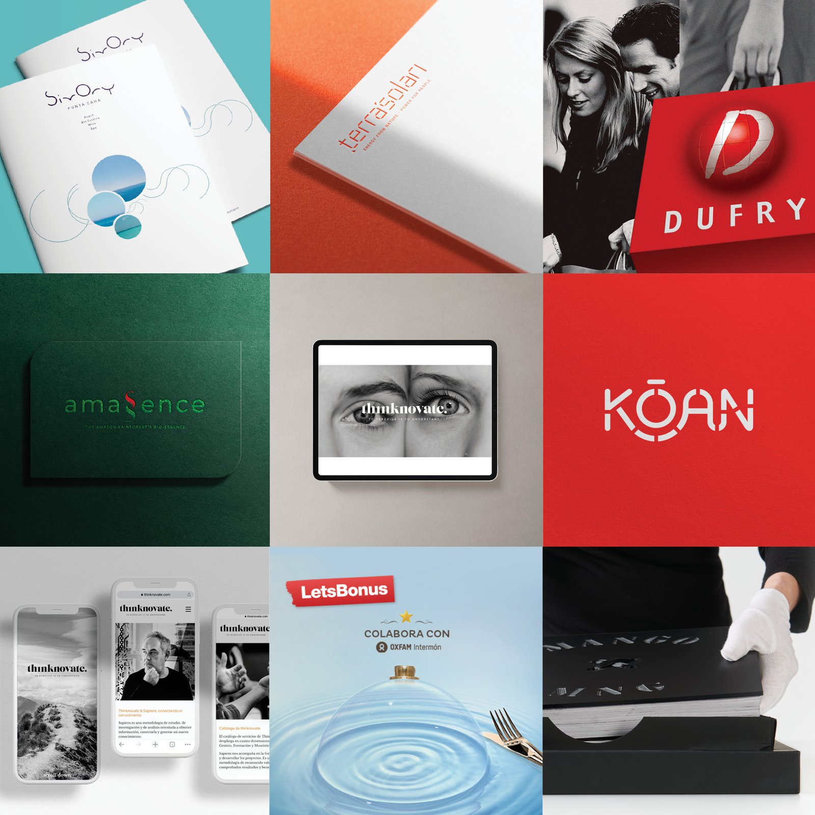
Selected Clients & BrandS
MY PILLARS
METHODOLOGY
The Macallan
elBullifoundation
Thinknovate
Dufry
LetsBonus
Telefónica
Amassence
Terrasolari
Gran Teatre del Liceu
La Vanguardia
SpainMedia Brands Influence & Data Kōan Publishing House
Moritz
NESTLÉ
Unilever
Bacardí
Procter & Gamble
The Ritz-Carlton
Abama Hotel Le Sivory Punta Cana
Gratacós
Mango
The Color Community
Cocoon Mirari
Together with my clients, I develop brand projects guided by intuition, data, and business insight — with strategy as our roadmap. I recognize that every brand is unique and requires a tailored approach to meet its brief and objectives. By blending strategic creativity, design expertise, and robust data, I bring high-impact brand identities to life — across digital and physical spaces, formats, and media.
Every branding or rebranding project is unique. Each involves research, conceptual development, insights, creative proposals, visual identity design, brand universes, and various deliverables. Depending on the scope, this may also include the creation of style guides and/or brand manuals.
PROJECTS
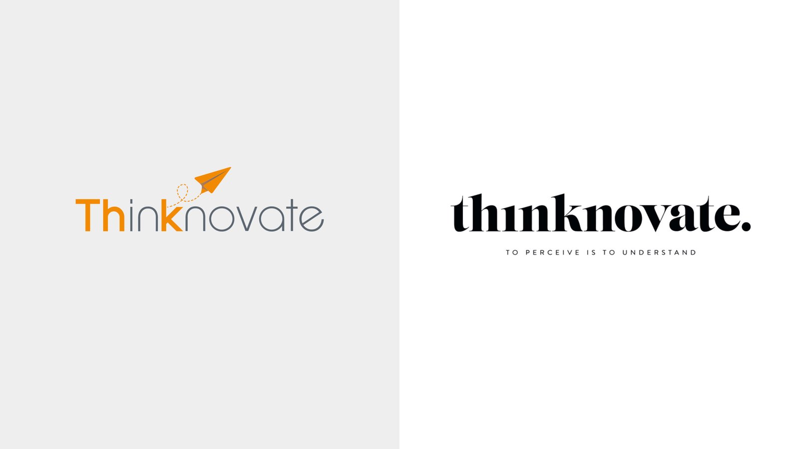
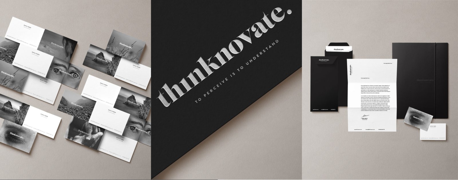
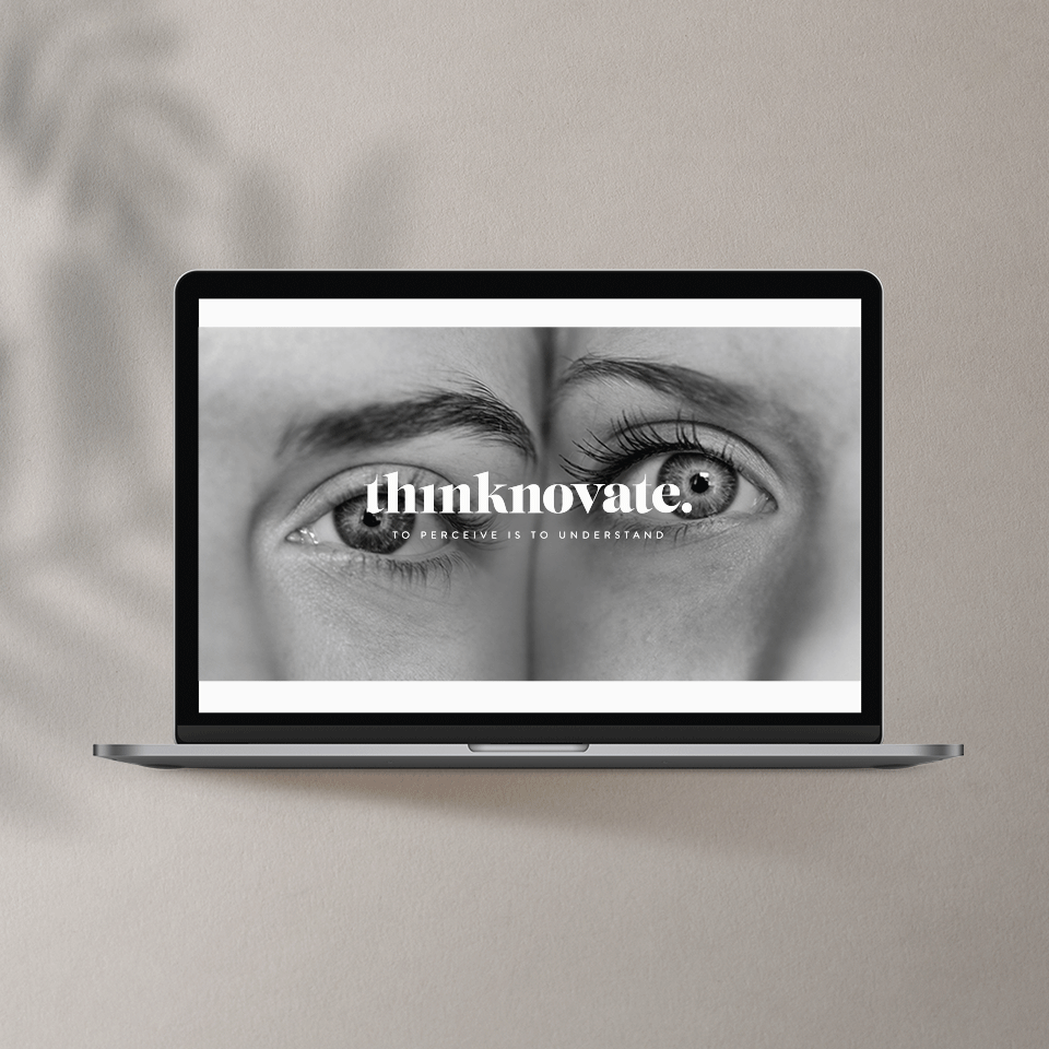
Thinknovate
REBRANDING
Thinknovate is an innovation consultancy with a human and holistic approach, created to help organizations innovate by connecting knowledge through proprietary tools and the Sapiens method — a unique methodology from Ferran Adrià.
The brand creation of Thinknovate included the brand strategy behind the brand, from naming, baseline, the brand identity, brand ecosystem, brand guidelines, website, corporate communication, collateral etc. The strategy, design system design and brand guidelines is not a public project but would be a pleasure to present them as a case study.
Thinknovate applies a structured system for study, research, and analysis aimed at gathering information, connecting it, and generating new knowledge to foster meaningful innovation. It’s a way to perceive and understand the world — and to rethink it. In business innovation, we often talk about processes, projects, and outcomes — but at the core, there are always people.
This project embodies not only a robust visual and strategic identity but also a purpose-driven narrative rooted in understanding the present to inspire future transformation. While some key materials — such as the full design system and brand guidelines — are not publicly available due to confidentiality, but can be presented upon request.


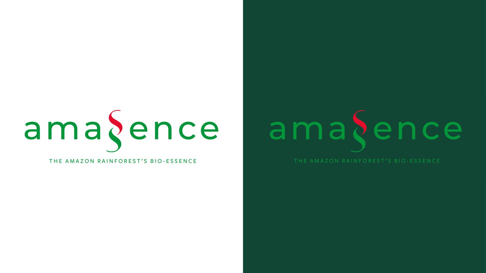
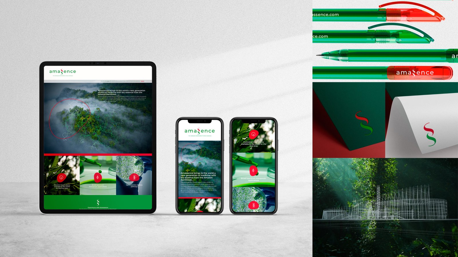
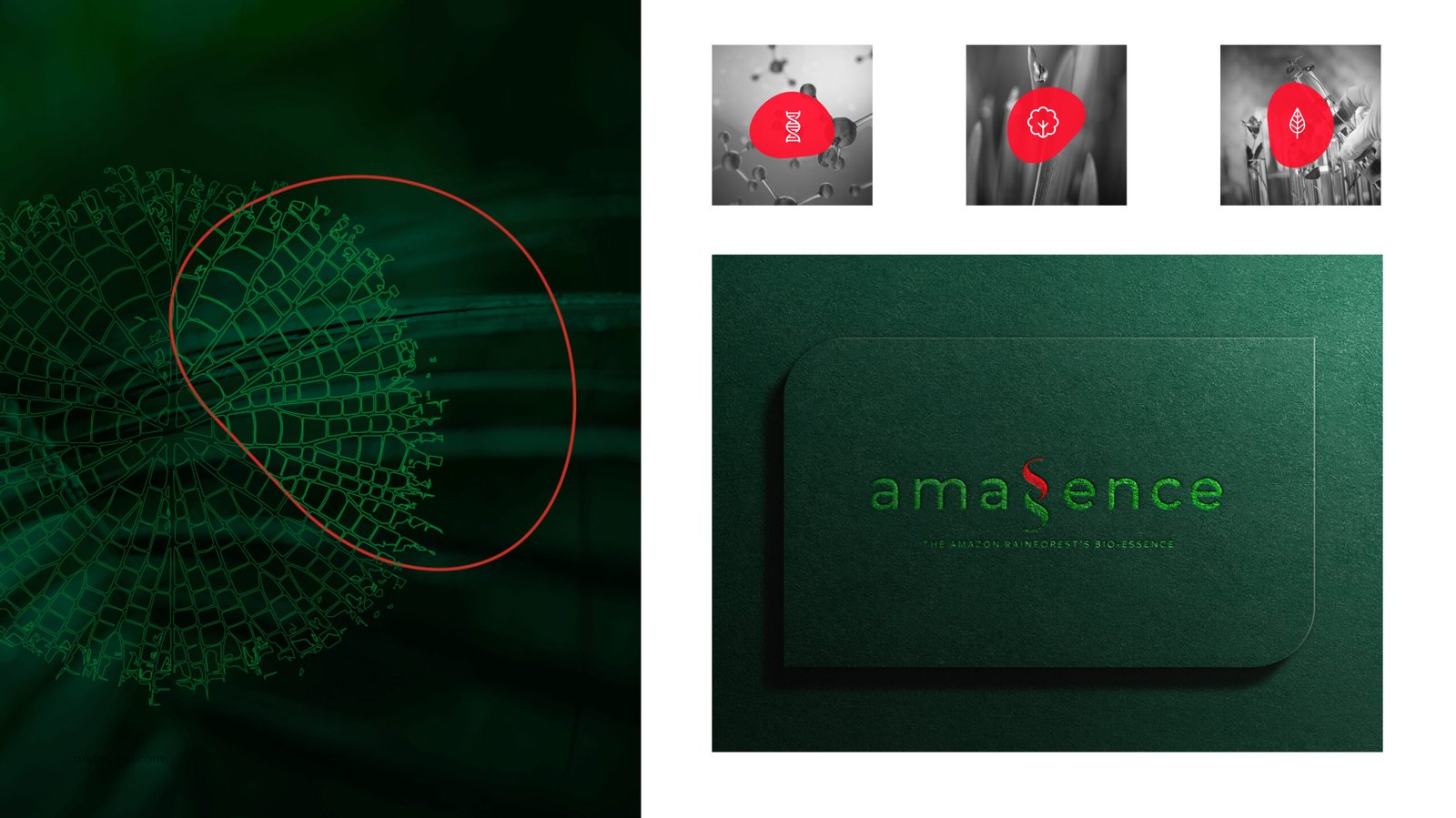
Amassence
NEW BRANDING
Building the brand for Amassence, an innovative brand in the phytopharmaceutical category, has been a rewarding challenge. We started with its source-based foundation, which is at the heart of its products. The company works with the DNA of Amazonian biodiversity as a source of life, and scientifically transforms it for human health.
Amassence brings to the world a new generation of bio-essence medicine from the Amazon Rainforest, a unique region that is the refuge of millions of years of bio-essence evolution with multiple therapeutic applications.
Positioning the brand in the world of science, together with authentic and genuine storytelling, was important to generate the necessary brand awareness and brand utility.
The visual identity conveys the concept of DNA, integrated into the typography and brand design to create a bold, modern and minimalist image. It reflects the dynamic and expert personality of a living company in motion, the values and characteristics of the healing power of plants and nature, as well as research and science.
The Amassence brand universe, with its typography, brand codes, illustrations, animations, photography and colour palette, conveys the spirit of science combined with Amazonian nature, which is fresh, alive, wise and unique.
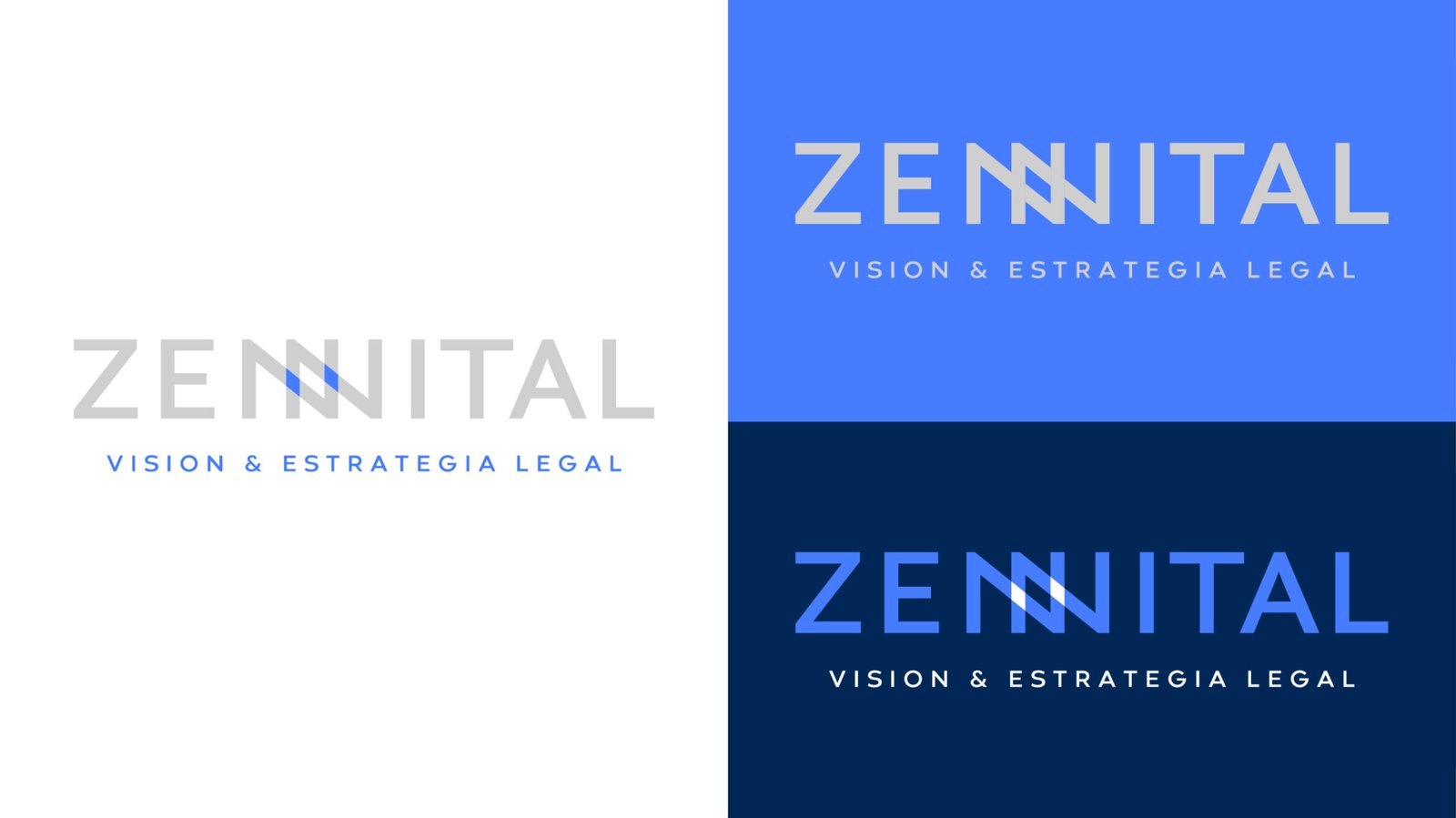
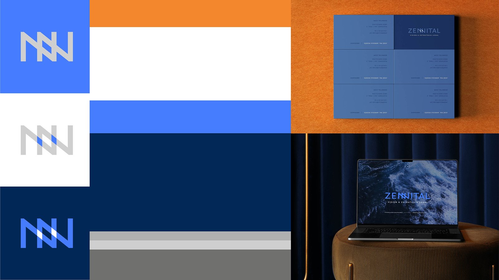
ZENNITAL Attorney & Law Firm
new branding
Zennital is a strategic legal partner — client-focused, future-oriented, and globally minded. With a cross-disciplinary approach and deep analytical insight, Zennital looks beyond the immediate and the obvious. Its advice is grounded in expertise and delivered with confidence, consistently achieving effective results across both corporate and private sectors.
We developed the brand identity by aligning it closely with their core DNA. Their methodology took a dual perspective: a top-down approach to understand the broader context, and a macro-focused lens to address every detail. We engaged deeply with each case, each client, and their specific realities — always striving to see the complete picture rather than isolated parts.
This mindset — seeing the whole without losing sight of the detail — inspired the brand baseline: At Zennital, we understand the problem through its solution.
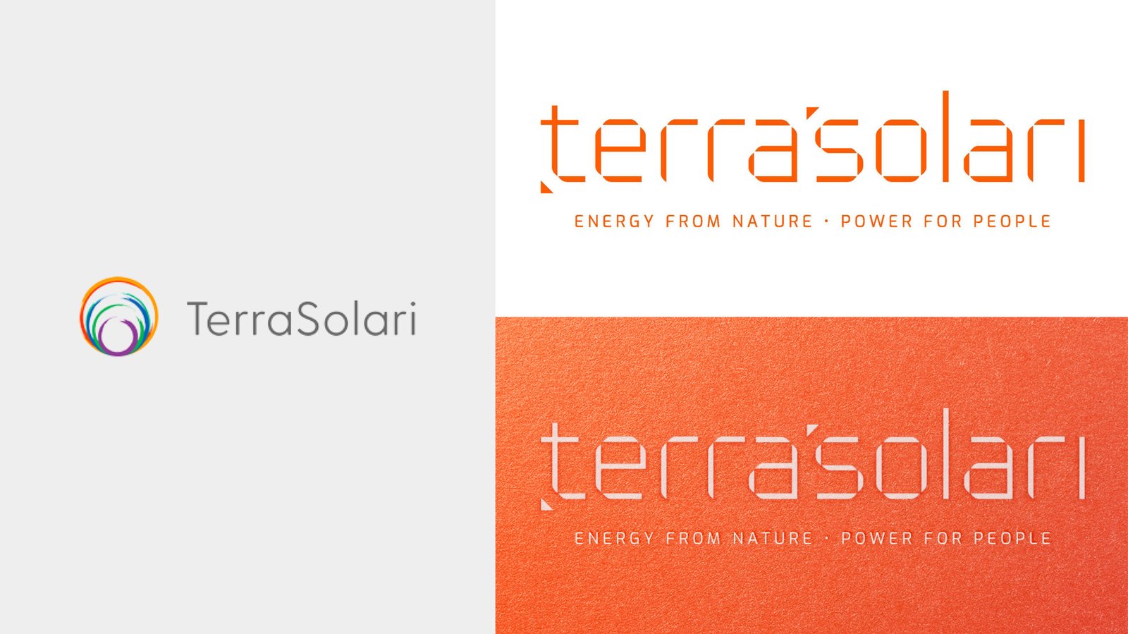
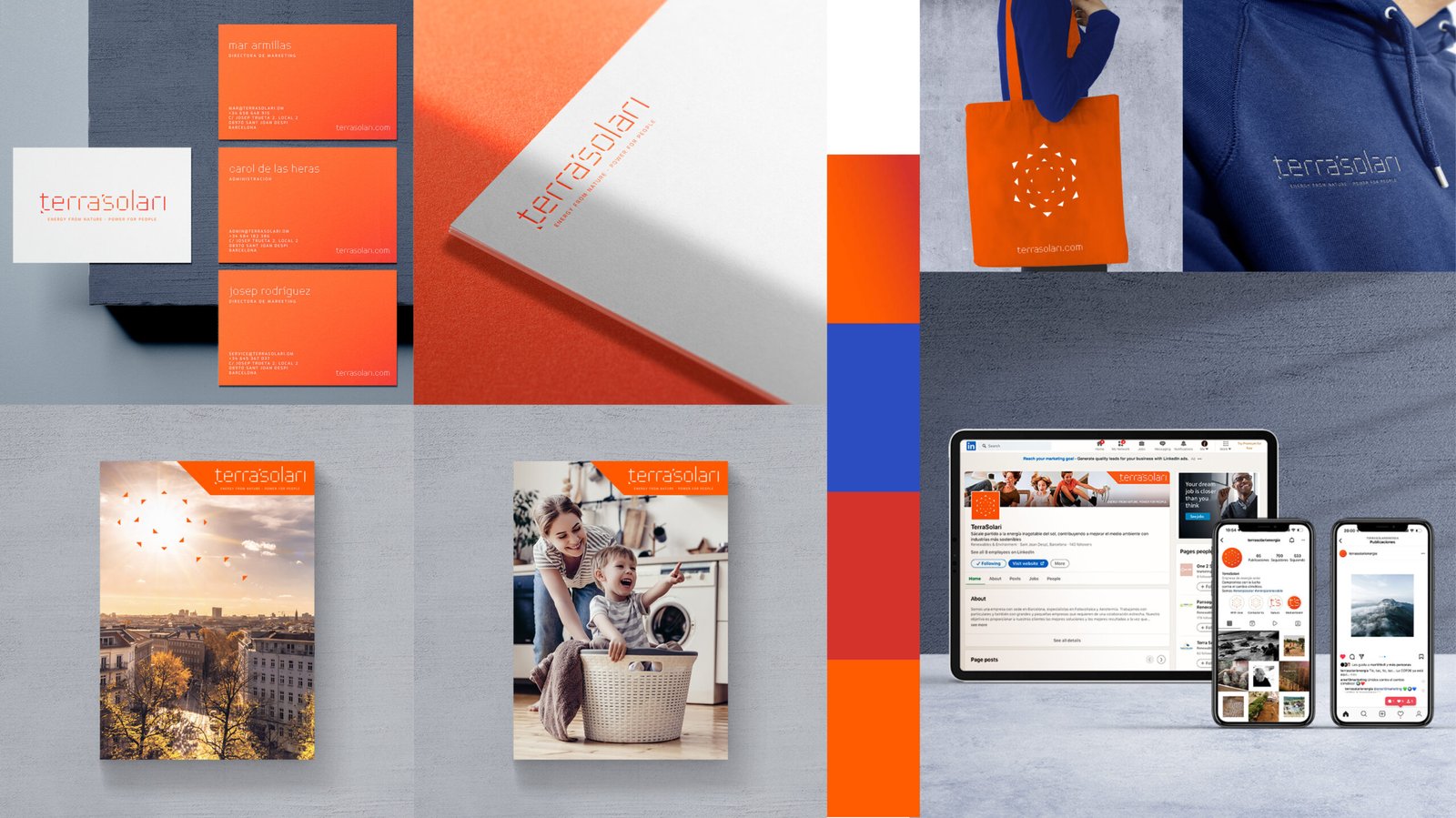
Terrasolari
REBRANDING
The rebranding of Terrasolari consisted of transforming the brand from a technical brand to a technological but "human" local brand, with a global vision of being first in the energy self-consumption sector in Spain, with a view to the world that focuses on two axes: people and the balance of the planet.
It is a brand with a soul that designs and implements solutions for energy self-consumption based on clean energies, specialising in photovoltaic and aerothermal energy.
The corporate identity we developed reveals the determination, the innovative attitude, the commitment and the social connection behind its activity, its values at an individual, corporate and collective level.
It started with the creation of the concept of the new positioning to generate the baseline of Terrasolari: POWER FROM NATURE, POWER FOR PEOPLE, we have created it in response to the reason why of Terrasolari, which is:
"The energy of nature, especially solar energy, is and will be the impulse, the light, the vitality and the energy for people. Because we have a passion for the planet, a passion for people".
The brand creation also included the brand identity, brand ecosystem, photography for business units, brandbook, brand guidelines, website, corporate communication, collateral etc. The strategy, design system design and brand guidelines is not a public project but would be a pleasure to present them as a case study.


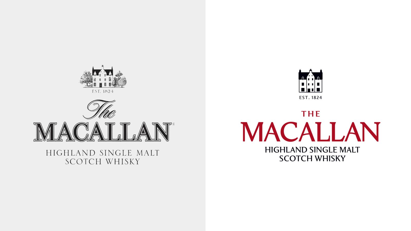
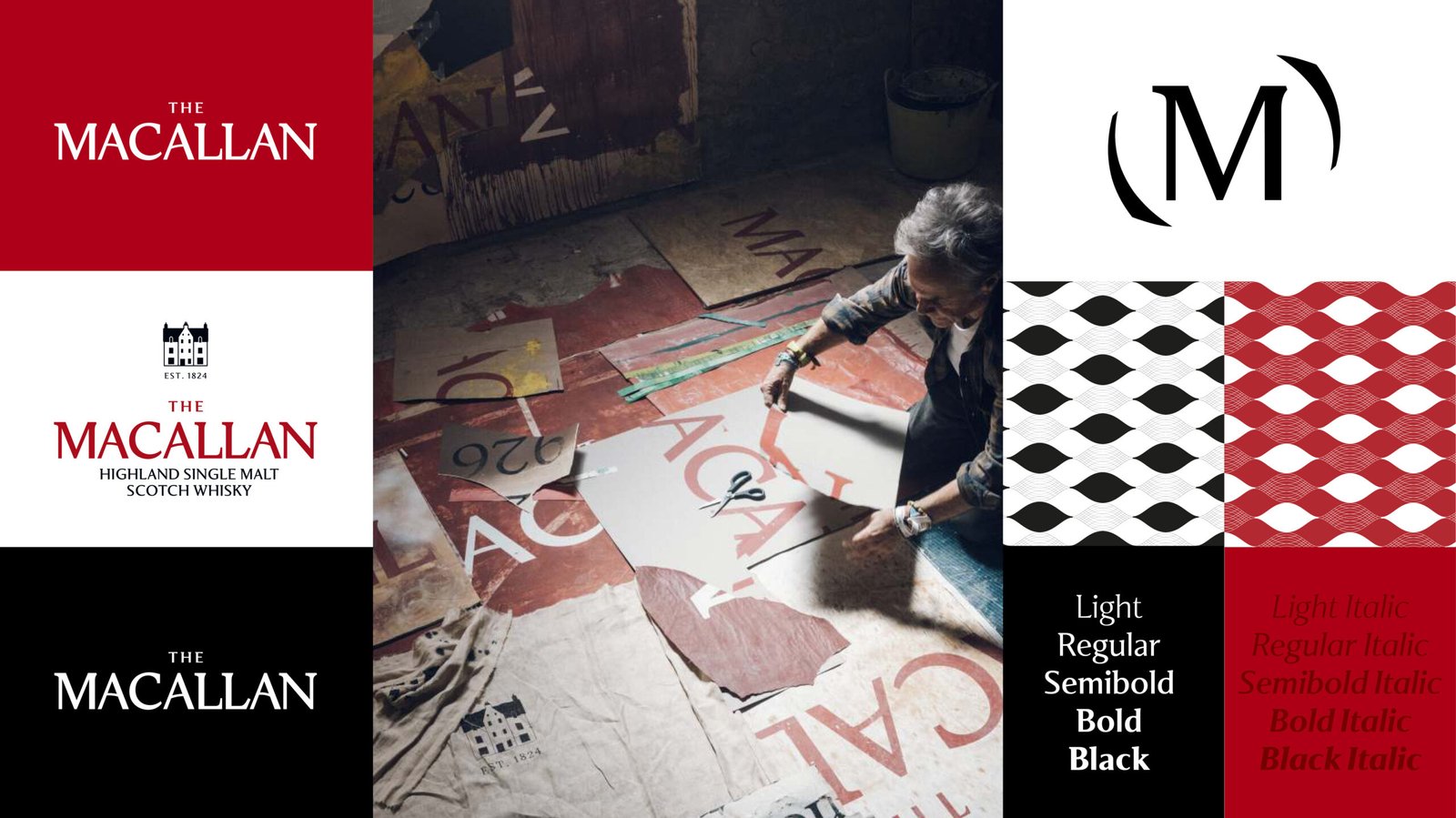
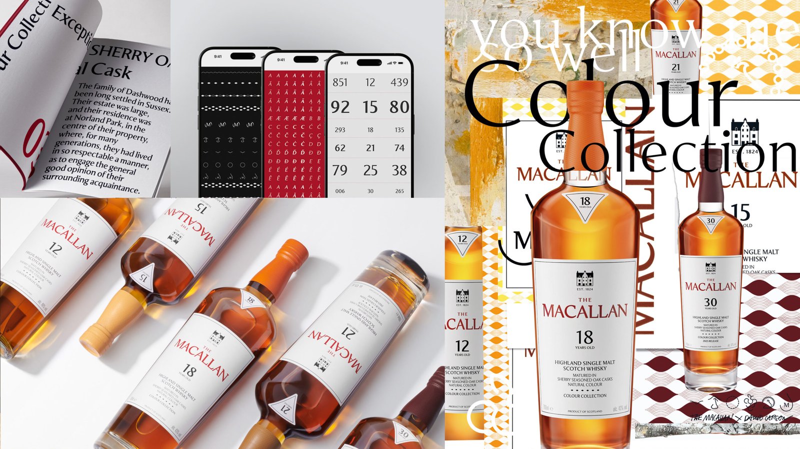
The Macallan
REBRANDING
The Macallan is a 200-year-old brand with a rich heritage and strong presence in the global luxury spirits market. I’ve worked on its ongoing rebranding — a large-scale, highly detailed project aimed at evolving the brand’s visual language while preserving its essence. This work spans thousands of assets, a new and extensive set of brand guidelines, and the application of the identity across digital activations, corporate communications, global campaigns, retail spaces, packaging and experiential touchpoints.
A key part of the process has been taking a holistic view of the brand — from visual identity and tone of voice to its digital and physical environments. To ensure consistency and clarity across all markets, several dedicated toolkits have been developed: Brand Identity, Brand Ecosystems, Permanent and Experiential Retail, Standards of Excellence, Social Media, Campaigns, and more. These work together as a comprehensive brand guide that not only details execution but also connects the brand’s past, present, and future — articulating how its heritage and DNA shape a bold, global vision for the years to come.
Worked closely with David Carson artworks, one of the most influential designers of the modern era, to reimagine the brand identity of The Macallan.
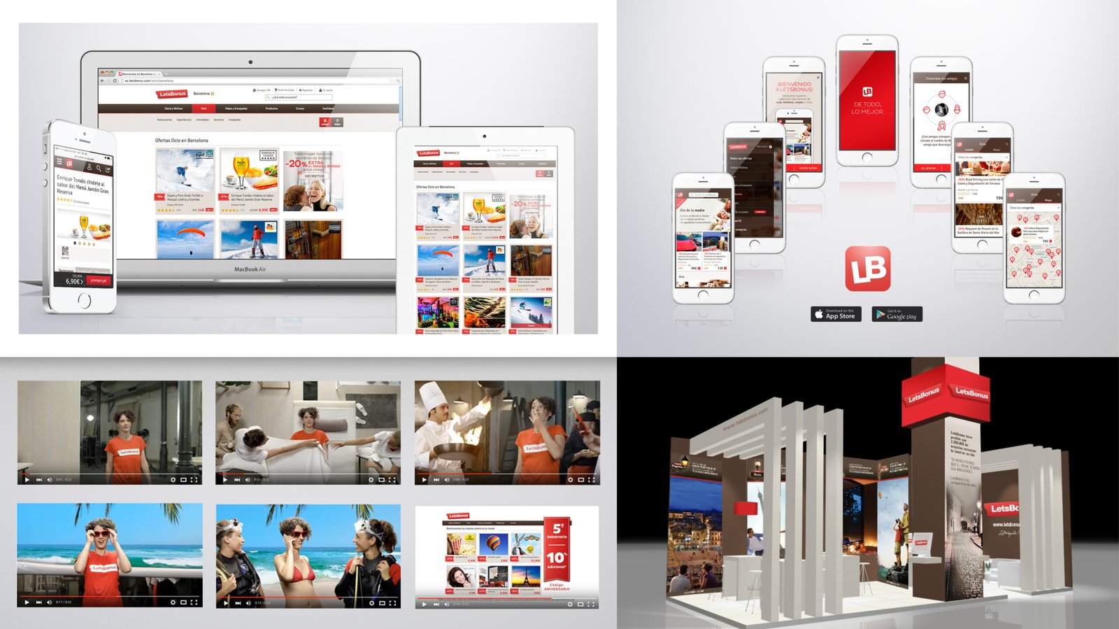
LetsBonus
NEW BRANDING
While no longer in operation, LetsBonus was one of the earliest and most influential daily deal platforms in Southern Europe, especially in Spain and Italy. As Head of Art and Design, I created its brand identity, brand ecosystem, brand book, website UI & brand, mobile platform brand UI, collateral, and brand communication for B2C and B2B purposes. It was a significant project in terms of scale, brand management, and the impact it had during the flash deal market boom. The current portfolio version is just a glimpse — I’d be pleased to share more details upon request.

Kōan Book Publishing House
new branding
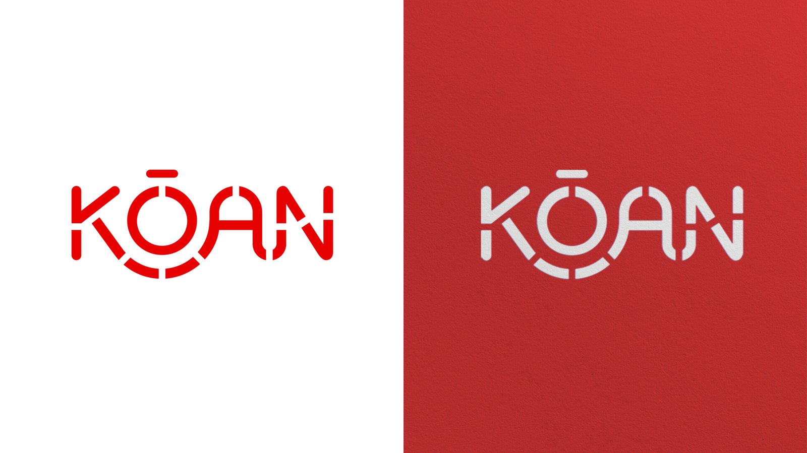
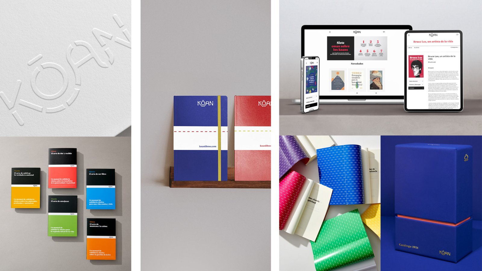
Koan Libros is an independent Spanish publishing house founded in 2018. Its primary focus is on self-knowledge and personal development, exploring the complexity of human life through diverse perspectives such as philosophy, psychology, health, and spirituality. But what is a kõan? The name Koan comes from a Zen practice involving paradoxical riddles or questions used to transcend logical reasoning and promote intuitive and spiritual understanding.
Koan Libros builds its identity around the idea of the path — a concept drawn from Zen koans, where walking the inner journey and living the question is more important than finding the answer. The clean, characterful logo is formed by paths and lines: K-A-N represents the container, and Ō the content. It expresses a brand rooted in intimacy, light and shadow — flexible, courageous, vital, and deeply reflective.
Aimed at a young audience, the identity stands out through its use of pure, bold colours and a simple, sincere graphic language. Illustration, created with international collaborators, serves as a visual code across the book collections. Both the collections and the website reflect the brand’s clarity and honesty, using space and white as essential tools to highlight the thoughtful, intelligent content at its core. Koan Libros is known for its carefully curated content and thoughtful design, aiming to provide readers with inspiring and supportive resources for their personal growth journeys.


Intellectual Property & Confidentiality
This portfolio forms part of the creative and professional work of Claudia Burbano de Lara. Any sharing, use, or reproduction—whether in whole or in part—of its contents is strictly prohibited without prior authorization. The information contained herein may not be used for any purpose without the explicit consent of Claudia Burbano de Lara.
Strategy | Creative Direction | Art Direction | Branding | Design
© 2025 BY MATHEREAL®